Toward a Congestion Heatmap of the Internet
June 3rd, 2016 by Amogh DhamdhereIn the past year, we have made substantial progress on a system to measure congestion on interdomain links between networks. This effort is part of our NSF-funded project on measuring interdomain connectivity and congestion. The basic nugget of our technique is to send TTL-limited probes from a vantage point (VP) within a network, toward the near and the far end of an interdomain (border) link of that network, and to monitor diurnal patterns in the near and far-side time series. We refer to this method as “Time-Series Latency Probing”, or TSLP. Our hypothesis is that a persistently elevated RTT to the far end of the link, but no corresponding RTT elevation to the near side, is a signal of congestion at the interdomain link.
It turns out that identifying interdomain links from a VP inside a network is surprisingly challenging, for several reasons: lack of standard IP address assignment practices for inter domain links; unadvertised address space by ISPs; and myriad things that can go wrong with traceroute measurements (third-party addresses, unresponsive routers). See our paper at the 2014 Internet Measurement Conference (IMC) for a description of these issues. To overcome those challenges and identify network borders from within a network, we have developed bdrmap, an active measurement tool to accurately identify interdomain links between networks. A paper describing the bdrmap algorithms is currently under submission to IMC 2016.
Our second major activity in the last year has been to develop a backend system that manages TSLP probing from our set of distributed vantage points, collects and organizes data, and presents that data for easy analysis and visualization. A major goal of the backend system is to be adaptive, i.e., the probing state should adapt to topological and routing changes in the network. To this end, we run the bdrmap topology discovery process continuously on each VP. Every day, we process completed bdrmap runs from each monitor and add newly discovered interdomain links or update the probing state for existing links (i.e., destinations we can use to probe those links, and the distance of those links from our VP). We then push updated probing lists to the monitor. This adaptive process ensures that we always probe a relatively current state of thousands of interdomain links visible from our VPs.
Third, we have greatly expanded the scale of our measurement system. We started this project in 2014 with an initial set of approximately ten VPs in 5-6 access networks mostly in the United States. We are now running congestion measurements from over sixty Archipelago VPs in 39 networks and 26 countries around the world. Our Ark VPs have sufficient memory and compute power to run both the border mapping process and the TSLP probing without any issues. However, when we looked into porting our measurements to other active measurement platforms such as Bismark or the FCC’s measurement infrastructure operated by SamKnows, we found that the OpenWRT-based home routers were too resource-constrained to run bdrmap and TSLP directly. To overcome this challenge, we developed a method to move the bulk of the resource-intensive processing from the VPs to a central controller at CAIDA, so the VP only has to run an efficient probing engine (scamper) with a small memory footprint and low CPU usage. We have deployed a test set of 15 Bismark home routers in this type of remote configuration, with lots of help from the folks at the Bismark Project. Our next target deployment will be a set of >5000 home routers that are part of the FCC-SamKnows Measuring Broadband America infrastructure.
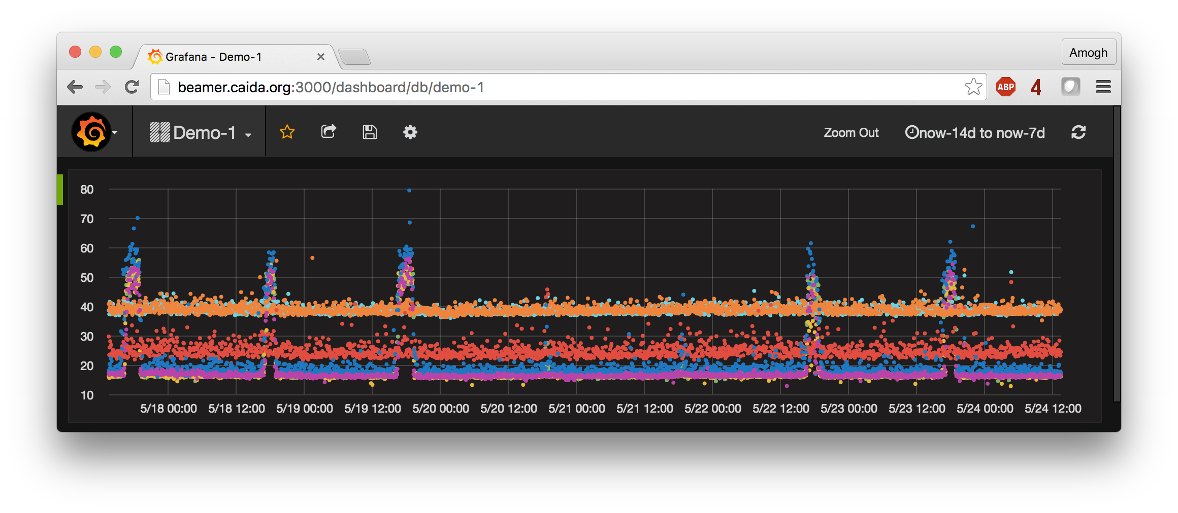
A fourth major advance we have made in the last year is in visualization and analysis of the generated time series data. We were on the lookout for a time series database to store, process and visualize the TSLP data. After some initial experimentation, we found influxDB to be well-suited to our needs, due to its ability to scale to millions of time series, scalable and usable read/write API, and SQL-like querying capability. We also discovered Grafana, a graphing frontend that integrates seamlessly with the influxDB database to provide interactive querying and graphing capability. Visualizing time series plots from a given VP to various neighbor networks and browsing hundreds of time series plots is now possible with a few mouse clicks on the Grafana UI. The figure below shows RTT data for 7 interdomain links between a U.S. access provider and a content provider over the course of a week. This graph took a few minutes to produce with influxDB and Grafana; previously this data exploration would have taken hours using data stored in standard relational databases.
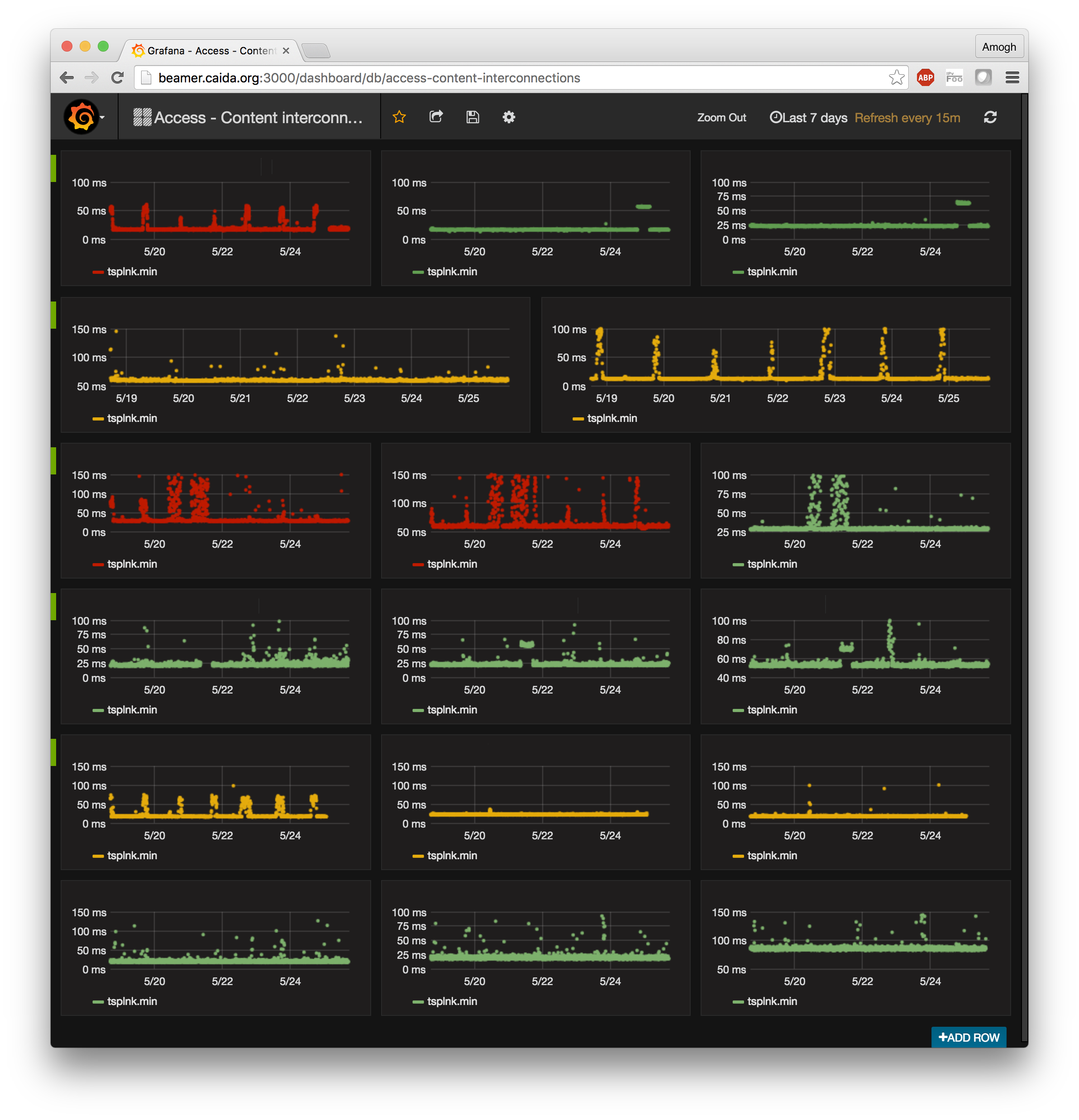
As the cherry on the cake, we have set up the entire system to provide a near real-time view of congestion events. TSLP data is pulled off our VPs and indexed into the influxDB database within 30 minutes of being generated. Grafana provides an auto-refresh mode wherein we can set up a dashboard to periodically refresh when new data is available. There is no technical barrier to shortening the 30-minute duration to an arbitrarily short duration, within reason. The figure below shows a pre-configured dashboard with the real-time congestion state of interdomain links from 5 large access networks in the US to 3 different content providers/CDNs (network names anonymized). Several graphs on that dashboard show a diurnal pattern that signals evidence of congestion on the interdomain link. While drawing pretty pictures and having everything run faster is certainly satisfying, it is neither the goal nor the most challenging aspect of this project. A visualization is only as good as the data that goes into it. Drawing graphs was the easy part; developing a sustainable and scalable system that will keep producing meaningful data was infinitely more challenging. We are delighted with where we are at the moment, and look forward to opening up the data exploration interface for external users.
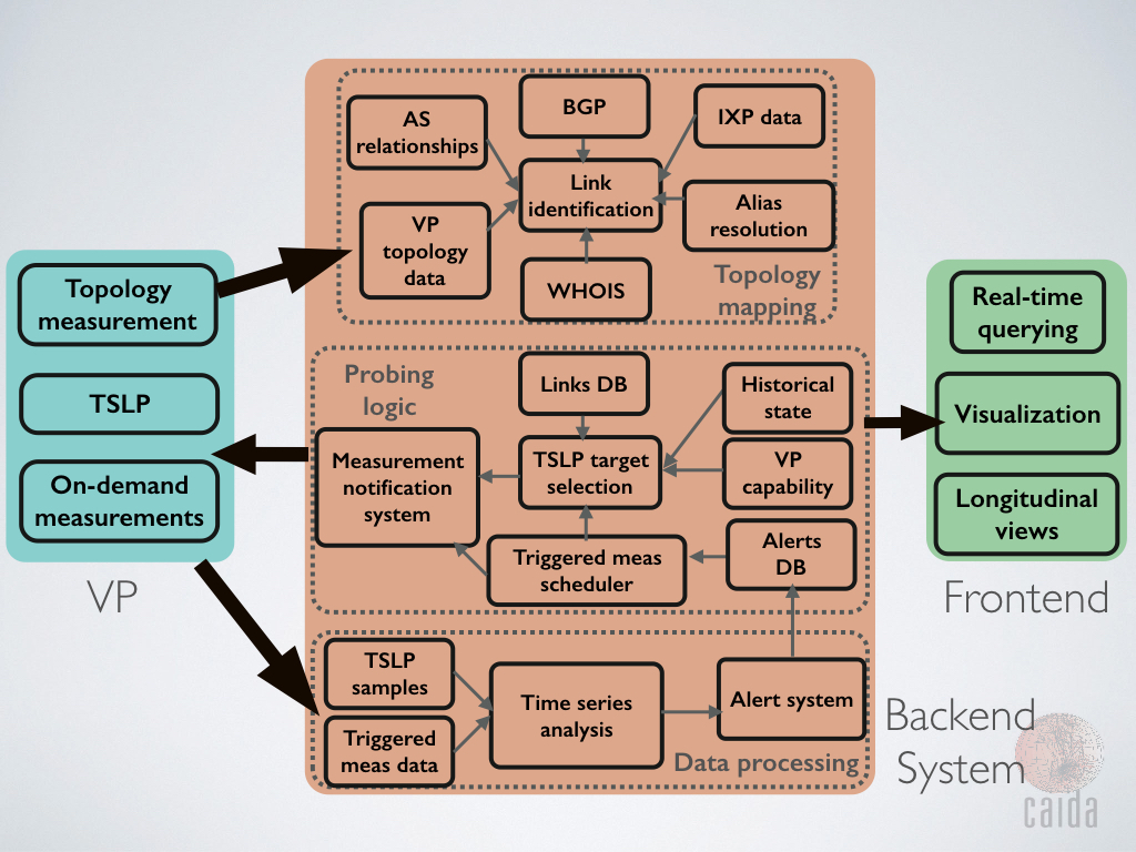
So what happens next? We are far from done here. We are currently working on data analysis modules for time series data with the goal of producing alarms, automatically and without human intervention, that indicate evidence of congestion. Those alarms will be input to a reactive measurement system that we have developed to distribute on-demand measurement tasks to VPs. We envision different types of reactive measurement tasks, e.g., confirming the latency-based evidence of congestion by launching probes to measure loss rate, estimating the impact on achievable throughput by running NDT tests, or estimating potential impacts to user Quality of Experience (QoE). The diagram below shows the various components of the measurement system we are developing. The major piece that remains is continuous analysis of the TSLP data, generating alarms, and pushing on-demand measurements to the reactive measurement system. Stay tuned!
The team: Amogh Dhamdhere, Matthew Luckie, Alex Gamero-Garrido, Bradley Huffaker, kc claffy, Steve Bauer, David Clark