Caidagram: visualizing geographically annotated Internet measurements
February 28th, 2011 by Alberto DainottiI post this article to describe the results of my five month visit to CAIDA and UC San Diego, and to thank the organizations that collaborated to make this work possible.
- CAIDA welcomed me as a visitor to UCSD’s renowned San Diego Supercomputer Center, to work on a new tool for Internet data visualization which we are calling “Caidagram”;
- RIPE NCC sponsored my visit at CAIDA, part of their continual efforts to cooperate with top Internet research groups in the world;
- Roma Tre is the University where I started a PhD program with the Compunet research group, after obtaining my Master’s degree accompanied by an internship held at the RIPE NCC.
We wanted to develop a tool to visualize different classes of geographically annotated Internet data, e.g., topology, address allocation, DNS, economic. The results of my visit here include a new interactive tool — Caidagram — derived from a decades-old visualization technique called a cartogram, a map whose geometry is distorted to convey information. This classic example depicts the United States with geographic distance distorted as a function of population per county, colored by the results of the 2004 presidential election popular vote.
Each caidagram extends the geographic mapping metaphor to other variables, while attempting to maximize intuitiveness and readability. With time-series data we used Caidagram to create interactive animations illustrating data trends over time. We show two examples of how the Caidagram can yield insight into real Internet data.
In the first example, we consider round trip times (RTT) between different end points, including one-to-many scenarios where we want to depict RTTs from different locations to a single endpoint. We place the common endpoint in the center of concentric circles representing increasing distances. We display countries (depicted by their geographic shapes) within the concentric circle that corresponds to their aggregated RTT values, facilitating comparison of macroscopic latency statistics on a per-country level. The screenshot below is a frame of an animation of RTT values from RIPE DNSMON monitors to the root server K. The center of the circle represents K-root (all distributed anycast instances), while the countries shown are some of those hosting at least one RIPE TTM monitor: USA, Netherlands, Italy, Japan, Australia, New Zealand, Switzerland, UK, Germany, Luxembourg, Estonia, Portugal, Austria, Sweden, Czech Republic, Israel, Cyprus.
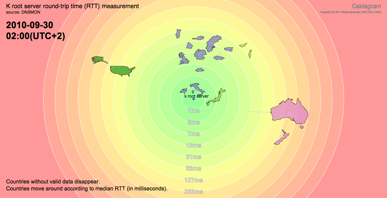
Caidagram, DNSMON example
The second example uses a more traditional cartogram technique to compare quantitative per-country Internet statistics, such as quantity of Internet addressing resources in use. The screenshot below distorts the shape of each country, either inflating or deflating its boundaries to correlate with the number of Autonomous Systems (ASes) associated with the country. At the same time, colors depend on how many ASes are IPv6 enabled in each country. The US is visibly dominant, despite its relatively small geographic area, while some European countries are more IPv6 enabled; continents like South America and Africa are virtually invisible.
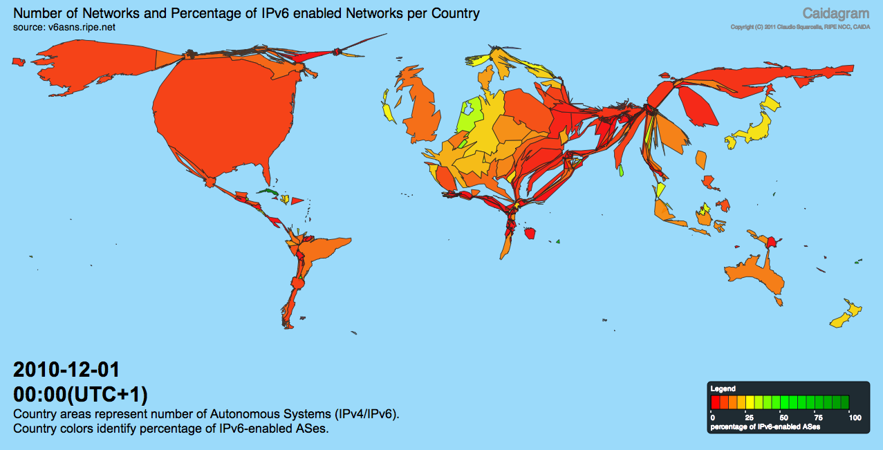
Caidagram, IPv6 enabled Networks
I introduced Caidagram at RIPE61 in Rome. The tool is implemented with AJAX for compatibility with most modern web browsers, and uses the Google Web Toolkit and Raphaël, a Javascript library for vector graphics. The source code is available here. For a live demo visit this link.